Brand Building
A brand is every sense, not just a logo.
The logo matters. But so does the playlist, the cup, the apron, the greeting, and the smell of espresso at the door. Brand is the total experience a guest has from first scroll to final sip — and it can be designed on purpose.
Visual Identity
Logo, color, type — the face of the company.
Visual identity is the part of the brand people can point at: the logo mark, the color palette, and the typography. Done well, these three stay consistent across everything — the sign above the door, the coffee cup, the Instagram grid, the gift card — until people recognize the business without reading its name.
For Joslynn’s, the logo direction is a refined monogram — the “J” and an ampersand, drawn in a serif with warmth in its curves — flexible enough to foil-stamp on a bag or shrink into a social avatar.
And here is the fun part: you are looking at the brand system right now. This website was built as a living style guide — its colors, fonts, and spacing are the exact system the physical salon will use.
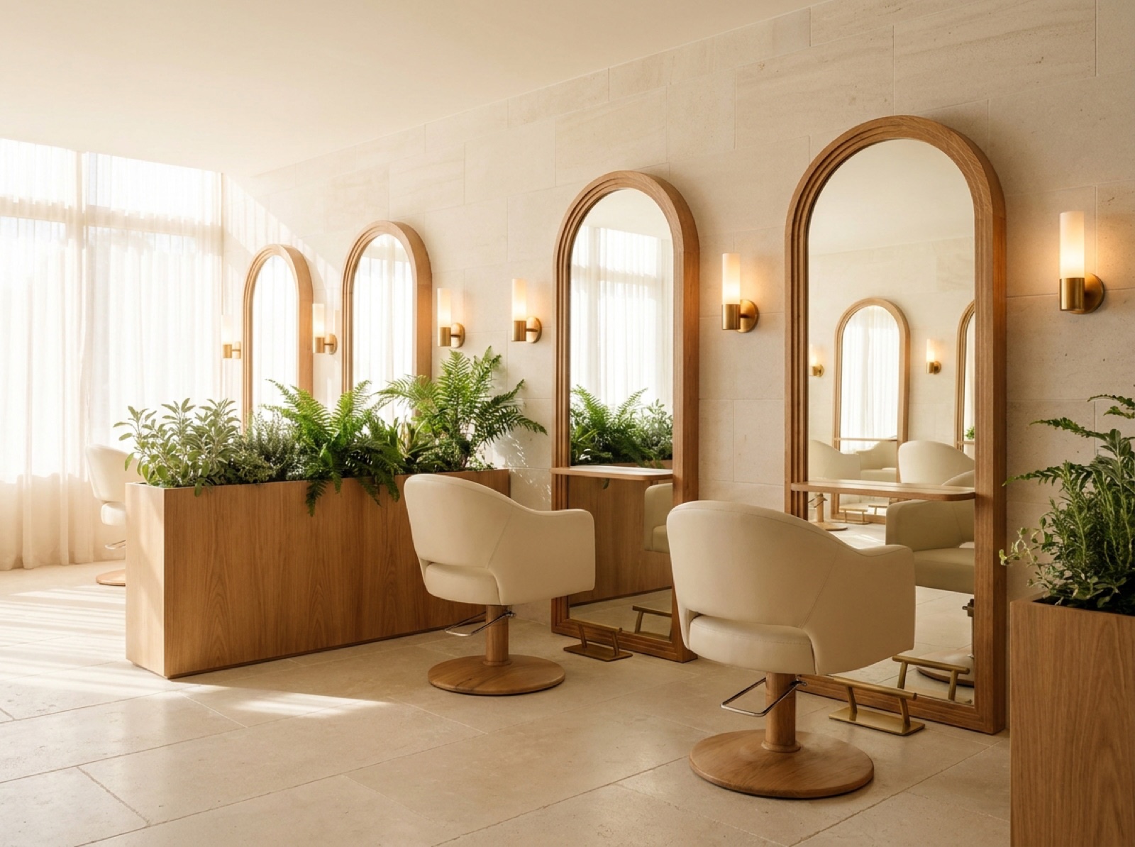
Identity Study 01
The styling floor · arched mirrors · daylight stations · ferns as screens
Brand Colors
The palette — live on this very page.
These six swatches are not a mockup. They are the working palette of this site — “Warm Atelier” — and they grew straight out of the three-color system in Joslynn’s original plan: Sage, Cream, and Wood, each chosen for what it does to a guest, not just how it looks. A good palette gives every color a job. (Hex values shown are the daylight palette; if you are reading in dark mode, the swatches adapt — which is itself a brand decision.)
Cream
#FAF6EFThe canvas. Walls, backgrounds, breathing room.
From Joslynn’s PlanCream = Comfort. Soft upholstery that promotes relaxation — and signals a high-end standard of clean.
Espresso
#2B211ADepth and warmth. Headlines, wood tones, the coffee itself.
From Joslynn’s PlanHer “Wood” = Grounding. Warmth and structural grounding for the whole organic theme.
Burnished Gold
#B08D3EThe signature. Accents, fixtures, foil on packaging.
Botanical Green
#3E5544Calm and growth. Plants, upholstery, the closing note.
Sage
#AEBFA8The soft echo of botanical. Tissue paper, secondary surfaces.
From Joslynn’s PlanSage = Growth & Connection. The color that visually unifies café and salon into one brand.
Warm Mute
#7A6D5FQuiet supporting text — present, never shouting.
Typography
Two typefaces, one conversation.
Every headline you have read on this site is set in Fraunces; every paragraph in Instrument Sans. The pairing is the brand’s tone of voice made visible — expressive where it matters, effortless everywhere else.
Display · Fraunces
Where beauty meets community.
A soft, slightly wonky serif with old-world warmth. Used for headlines, the oversized numerals, menu names, and the logo direction. It carries the “atelier” half of Warm Atelier.
Body · Instrument Sans
Clean, friendly, and easy to read at any size.
A modern sans-serif that stays invisible so the words do the work. Used for body copy, prices, buttons, labels — everything functional. It carries the “warm” half: approachable, never stiff.
Beyond the Screen
Where the brand becomes physical.
Photography Style
Natural window light, warm tones, real texture — steam curling off a latte, hair mid-movement, hands at work. No harsh flash, no sterile white studios. Every image should feel like 4pm sunlight in the salon. Consistency here is what makes an Instagram grid recognizable at a glance.
Interior Design
The space is the brand you can walk into: cream walls, warm wood stations, brass fixtures echoing the gold, and plants everywhere the eye rests. The café counter greets guests first — because the smell of espresso is the brand’s opening line. Straight from Joslynn’s plan: wood-frame furniture with cream upholstery, oversized and plush, chosen deliberately for “long stays.”
Packaging
Coffee cups in cream with the gold monogram, retail bags in espresso brown with sage tissue, a hand-written thank-you on every product sold. Packaging is the piece of the salon guests carry out the door — design it like it will be photographed, because it will be.
Employee Uniforms
Not stiff uniforms — a dress code with a palette. Team members wear cream, espresso, black, or botanical green, with a gold-accented apron for café staff. Guests should be able to spot a team member across the room without reading a name tag.
Sensory Brand
A brand is also what a space smells and glows like, and Joslynn’s plan is specific: subtle lavender or rosemary diffused throughout, layered over fresh espresso at the counter. Lighting works in two temperatures — soft, warm LED in the café so guests settle in, and daylight-spectrum bulbs at the styling stations so color work reads true. A steady playlist — warm acoustic and soft soul, never chaotic — ties it together.
Customer Experience Standards
Written standards make warmth repeatable: every guest greeted within 30 seconds, every service begins with a consultation and ends with a rebooking invitation, every drink handed over with the guest’s name. When it is written down, it survives busy Saturdays and new hires.
Brand Voice
How the brand talks.
Voice is the personality in the words — on the menu board, in a caption, in how a cancellation text is worded. Joslynn’s speaks like the salon feels: warm, confident, and plain-spoken. A one-page voice guide keeps everyone who writes for the brand — including future employees — sounding like the same person.
A simple test for any sentence: would you say it out loud to a guest in the chair? If not, rewrite it.
Warm — like a friend who happens to be a pro
Gushing or fake-familiar
Confident — we know our craft
Boastful or dismissive of others
Plain-spoken — real words, short sentences
Jargon, buzzwords, “luxury-speak”
Encouraging — everyone leaves taller
Preachy or lecturing
Social Media Identity
One grid, one feeling.
On social, the brand system compresses into a thumbnail: the same warm photography, the cream-and-gold caption graphics, the Fraunces headline on every cover slide. Someone scrolling fast should feel the palette before they read the handle.
Practical rules that keep the identity tight: shoot in the same corner of the room with the same light; use a small set of caption templates instead of new designs every week; keep the bio, handle, and profile photo identical across Instagram, TikTok, Facebook, and Pinterest; and let the story format be looser and more personal — the grid is the gallery, stories are the studio.
Started at 15, this consistency compounds. By opening day the brand will not be launching to strangers — it will be opening its doors to an audience that watched it grow up.
A brand this considered deserves an audience.
Next: how to carry the Warm Atelier identity into content, community, and a grand-opening strategy that starts years early.